The ROLI Learn app is getting a new look
Check out the latest updates that’ll make your learning experience clearer, calmer, and more enjoyable
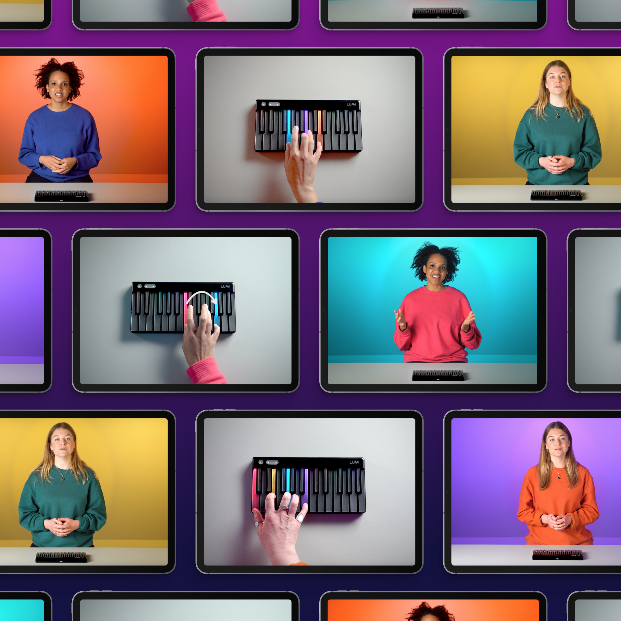
A fresh look for ROLI Learn
We’re always looking for ways to make ROLI Learn a more focused, inspiring place to play and grow. This latest update brings a cleaner design and clearer visual flow — all based on feedback from you, our learners.
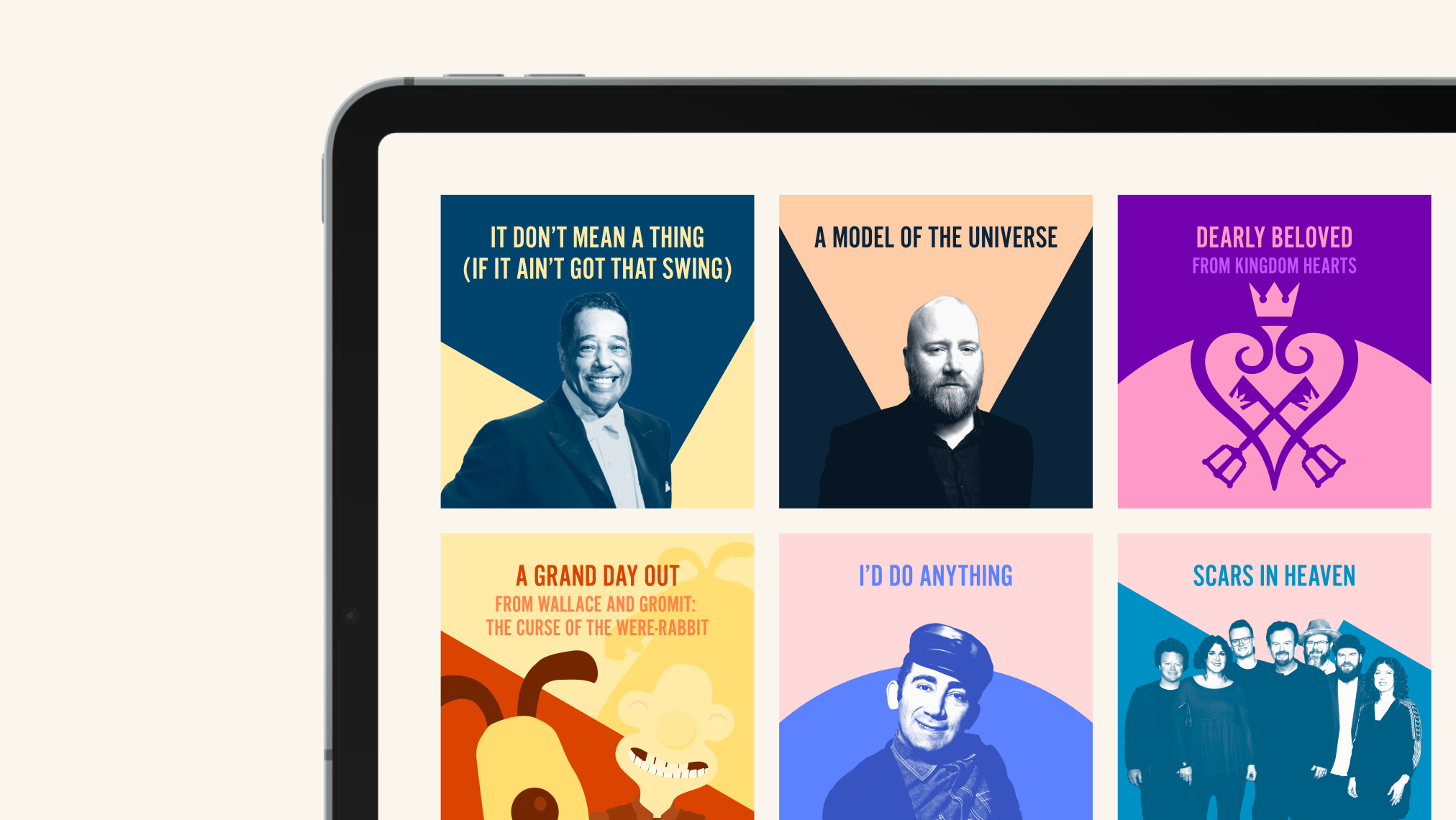
Many of you told us that the home screen could feel a little overwhelming at times, with so much great content to explore. So we’ve refined the layout and colors to help you navigate more naturally, stay focused on your current lesson, and enjoy a smoother overall experience.
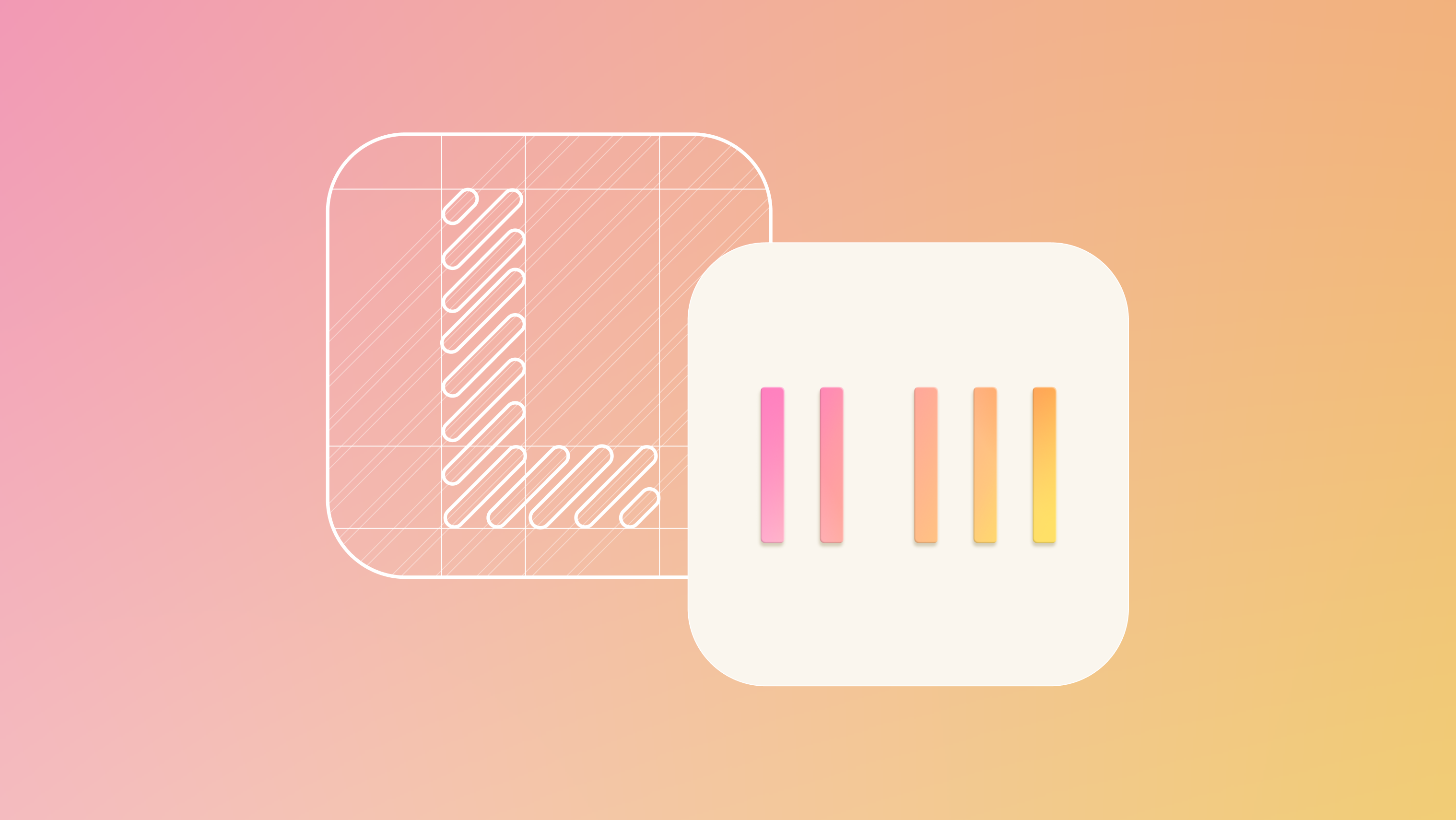
A new app icon
You’ll spot the change right from your home screen — the ROLI Learn app icon has a new look. It’s a simple update that represents a more streamlined, focused experience waiting for you inside the app.
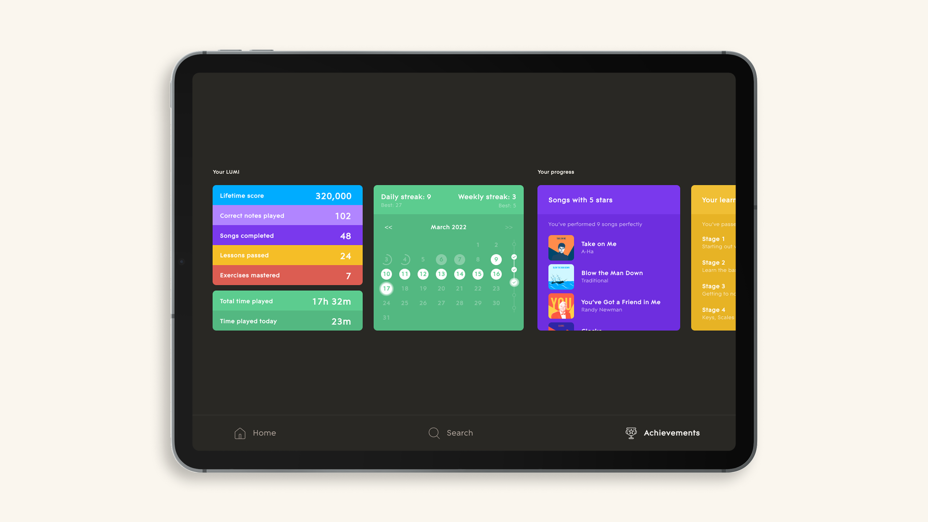
A new color palette for better focus
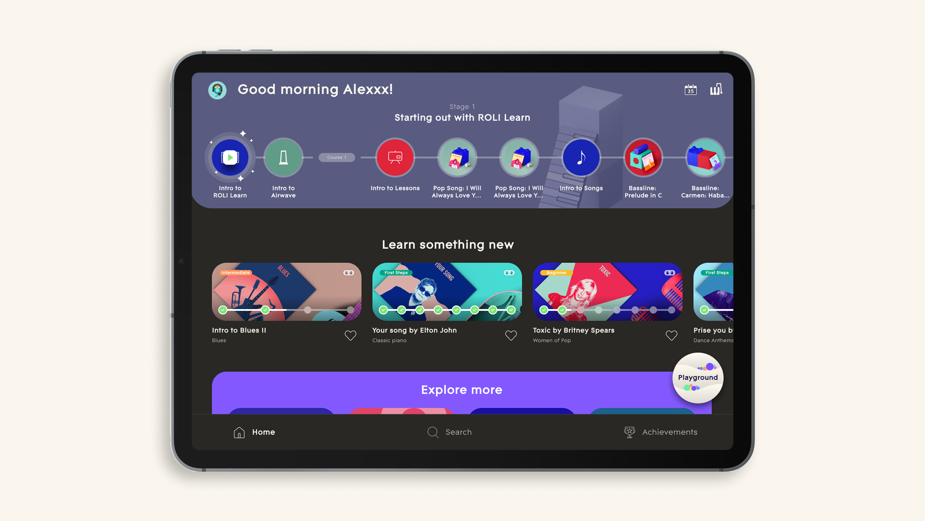
Once inside the ROLI Learn app, you’ll notice our biggest visual update yet. The interface now features a new ebony and ivory palette — a nod to the piano keys, and a design choice that helps you focus where it matters most.
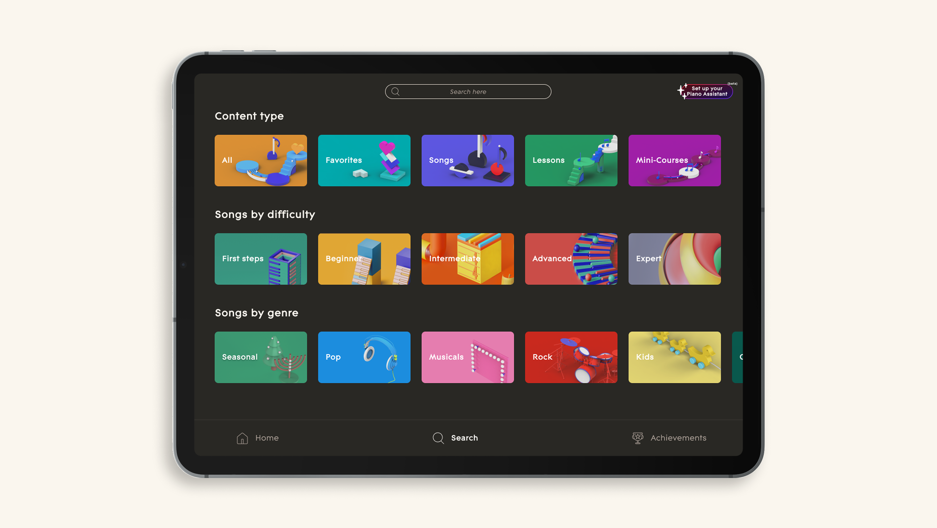
This shift from the previous blue ROLI Learn app theme brings:
A calmer, less cluttered feel when browsing lessons
Clearer contrast between different content types
Better visibility in lesson stages and learning paths
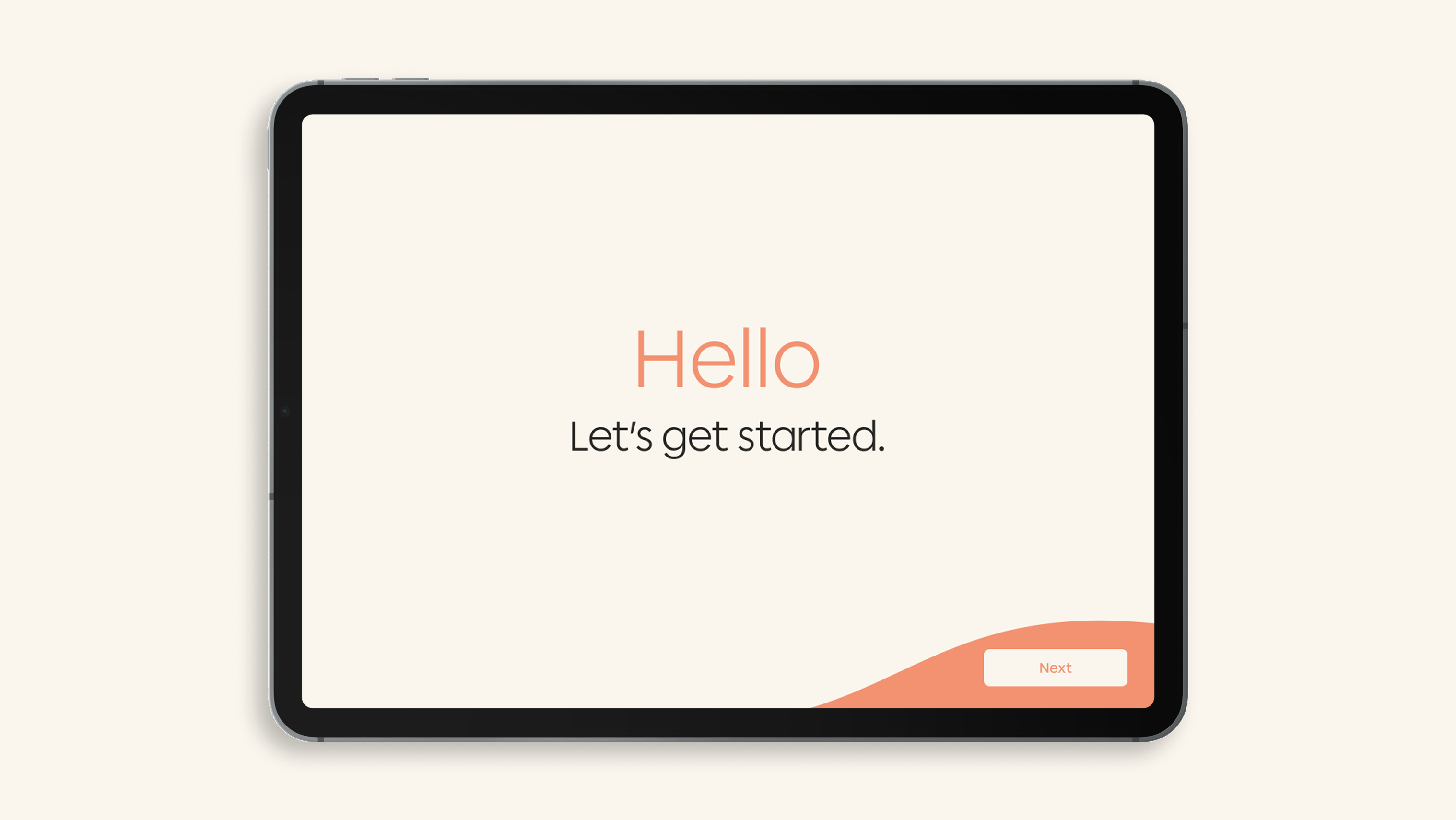
We’ve also carried this refreshed design across key screens, such as Get Started and Sign In, so your learning journey feels seamless from the moment you decide to practice.
The first of many improvements
These changes are designed to make things feel easier from the moment you open the ROLI Learn app. With a simpler layout and clearer contrast, it’s now easier to spot where you left off in your last practice, what’s new to learn, and what to try next. You’ll spend less time figuring out where to go and more time actually learning and playing.
Whether you’re starting a new course or just want to play along with your favorite songs, you’ll find it easier and progress on your piano learning journey faster. And this refreshed look is just the start. We’re always building on your feedback and working to make the ROLI Learn app a more intuitive and enjoyable space to learn, play, and grow.
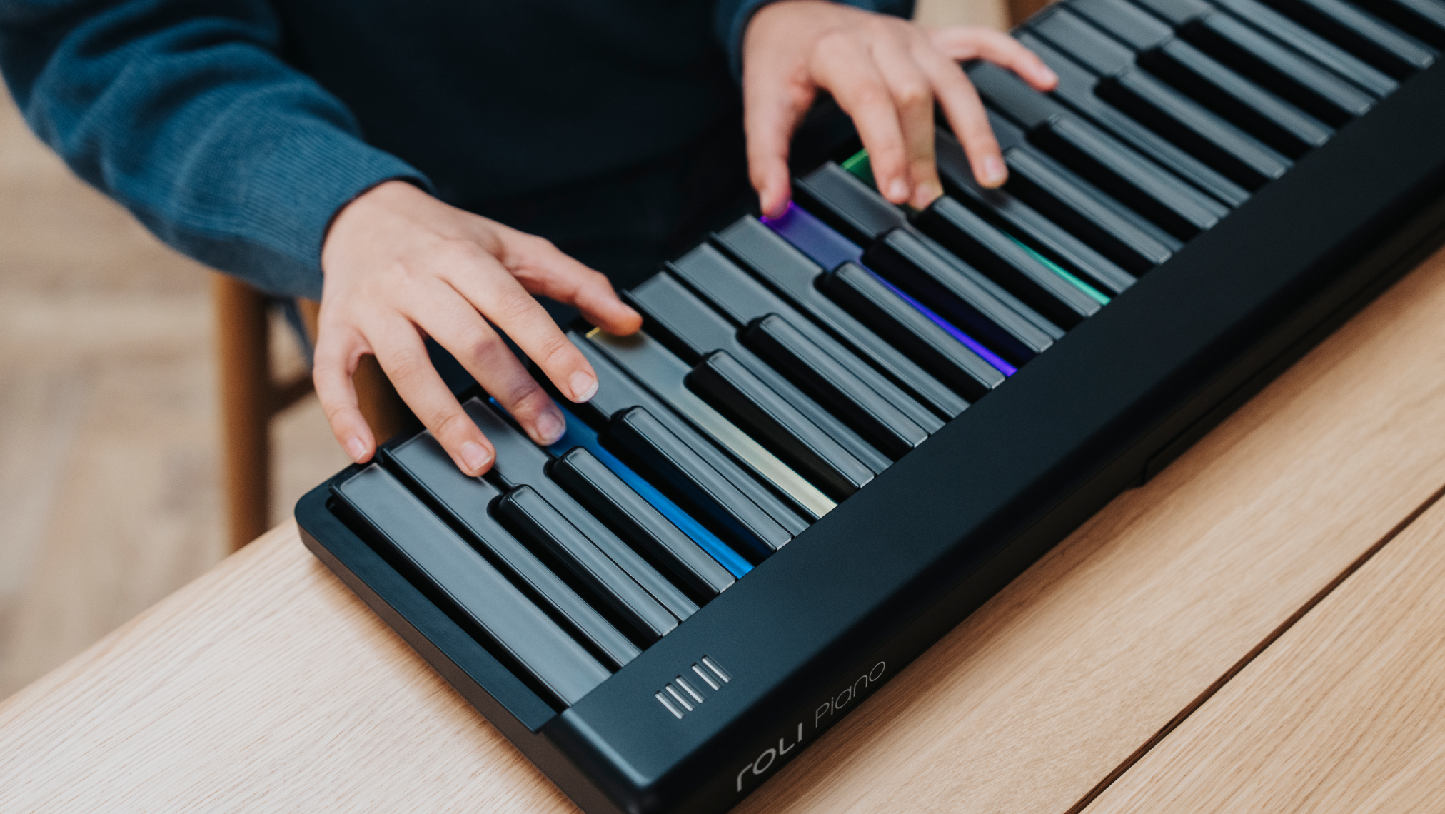
Want to learn more about the ROLI Learn System? Check out Airwave, ROLI Piano, Piano M, and the ROLI Learn app.
Suggested articles
Introducing Playground Free your piano practice with ROLI Learn
28 new two-handed lessons in the ROLI Learn app
Discover 50 new songs in the ROLI Learn app
Learn to play piano chords with new ROLI Learn lessons
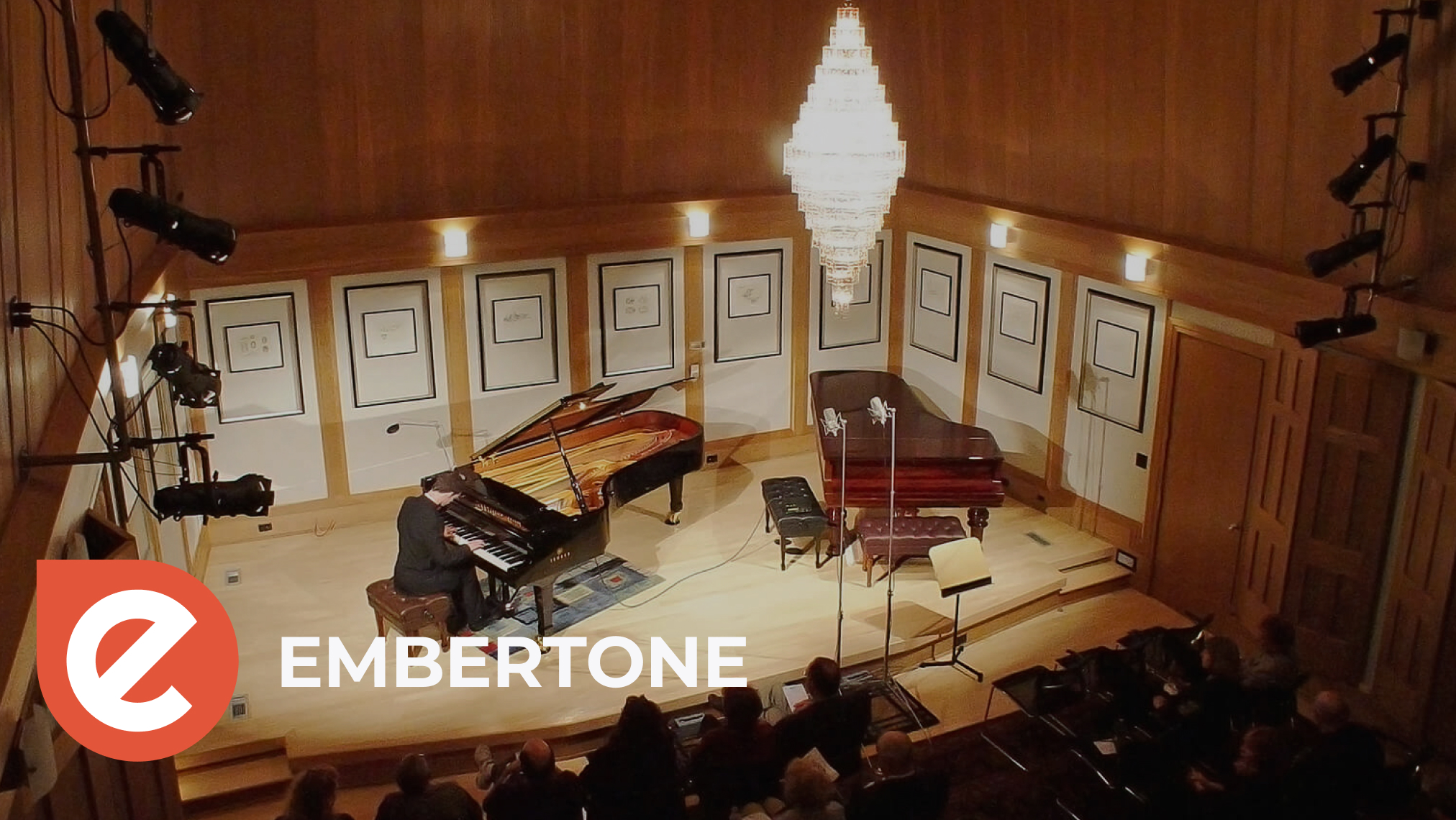
Lifting the lid on ROLI Learn’s new piano sound with Embertone
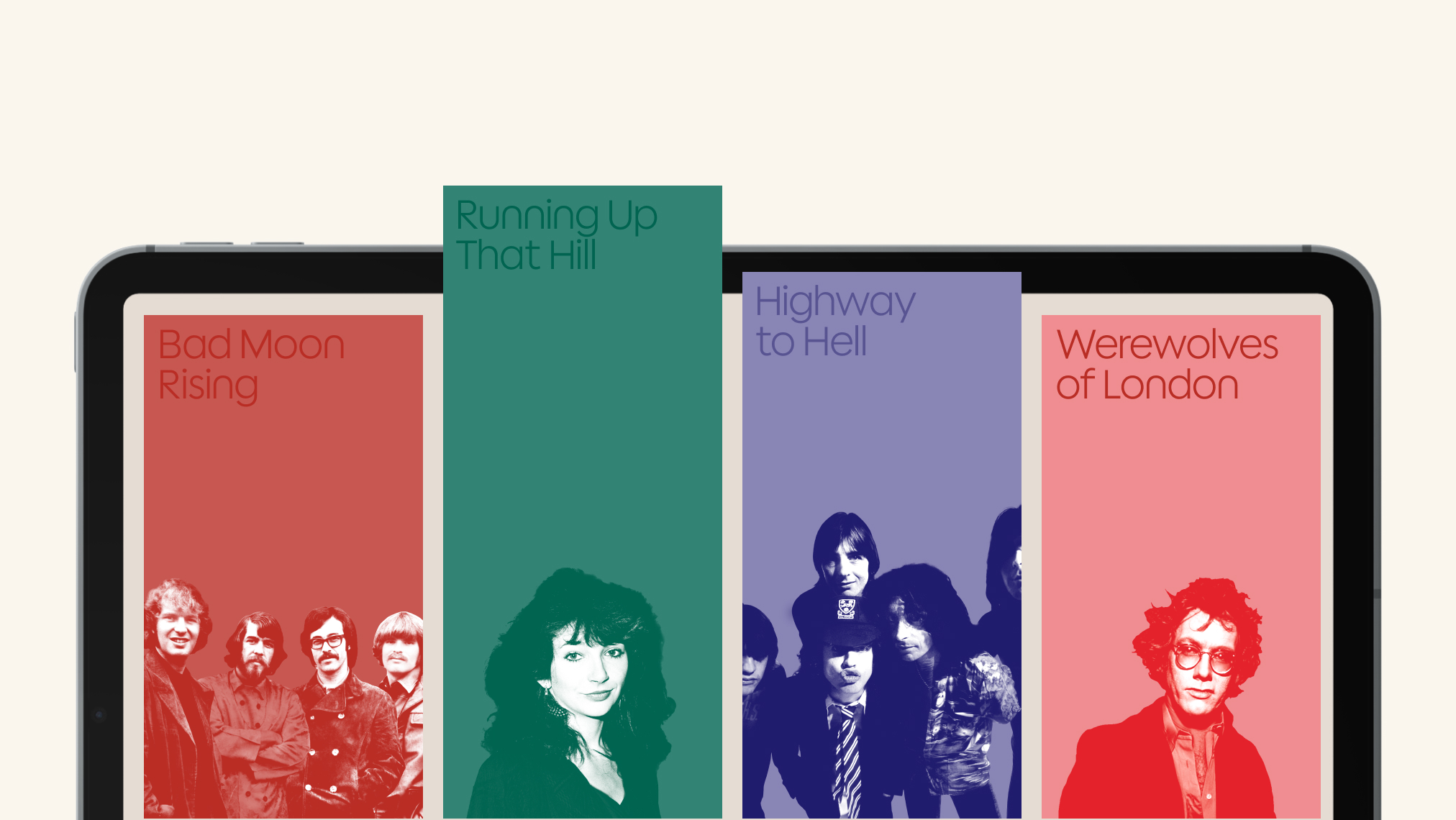
Halloween hits in the ROLI Learn app
Join the ROLI community